
stsRating
Version 1.0
Sons of Thunder Software, Inc.
Description
Kind of DropTool
Behavior-based
Interface Support
Unless specifically stated, this control will function properly on all platforms, although its look-and-feel is intended for the platforms listed in the table to the left.
Custom |
Mac OS X |
Windows |
Linux |
iOS |
Android |
|
|
Extra Features
|
|
"About" Stack | |
|
|
"Inspector" Stack |
Screenshots
|
|
|
|
|
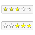
Left-to-Right |
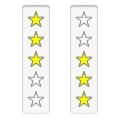
Top-to-Bottom |
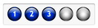
Numbered Spheres |
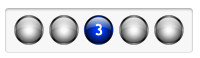
Numbered Spheres |
Other Image Sets
| Image Set Name | Preview | Notes |
Automatically Installed on First Drop |
||
| Basic Stars (16px) |  |
|
| Inset Stars (16px) |  |
|
| iTunes Music (13px) |  |
This is what is used for rating music in iTunes. |
| iTunes Apps (13px) |  |
This is what is used for rating applications in iTunes and the Mac App Store. |
Additional Ratings Image Sets |
||
| Basic Stars (32px) |  |
|
| Windows Music Player (WMP) Stars (13px) |  |
|
| Hearts (32px) |  |
|
| Hearts (16px) |  |
|
| Hearts (10px) |  |
|
| Blue Sphere (32px) |  |
|
| Blue Sphere (16px) |  |
|
| Red Sphere (32px) |  |
|
| Red Sphere (16px) |  |
|
| Yellow Sphere (32px) |  |
|
| Yellow Sphere (16px) |  |
|
Specialty Image Sets |
||
| Numbered Sphere (32px) |  |
|
| Questionnaire | 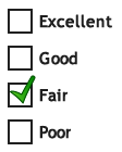 |
|
| Thermometer | 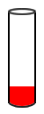 |
|
Usage Notes
Construction
The stsRating control is built as a combination of image and group objects, and is put together in this fashion: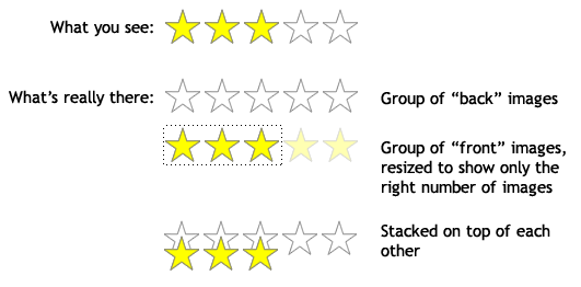
Image Sets, Slots, and Layers
The images that are used to display the front and back of the control are collectively referred to as an "image set", and the number of images that the user sees are called "slots". The images are grouped into two separate layers: the front layer and the back layer. So when the user sees an stsRating control that has five possible stars, there are five slots in the control. There are a minimum of two images used for an image set - one to represent all the slots in the front layer and one to represent all the slots in the back layer; the stsRating control knows to duplicate these images for each slot in the appropriate layer. This "single image" approach is the most common (in fact all of the image sets installed on the first drag-drop are "single image" image sets). You are not restricted to one image for each layer, however - you can have a series of different images that can be displayed in a given layer. Here's a comparison of the two (just looking at the front images):|
|
|
|
Single Front Image |
Series of Front Images |
|
|
|
|
|
Front: Single Image |
Front: Series |
Front: Series |
"Same Size" Rule: Regardless of whether you use single images or series, the size of the front image and the size of the back image in a given slot must be the same; you can't have a front image that is 40x20 and a back image that is 41x15 in the same slot. They must both be the same within a slot, but can be different between slots: one slot can be 40x20 and another slot can be 41x15.
So although the front image in the middle example above looks like it's just a green checkmark, it's really a green checkmark in a larger image object that is mostly transparent and matches the dimensions of the "Fair" back image (in this case).Using a Series of Images
One thing to be aware of though, and that is that if you use an image set that uses a series of images for a given layer, the maximum number of slots that can be displayed will be based on the maximum number of images that are provided for that layer. So in the "series" picture shown above, if there were only five front images provided, the stsRating control could only be set to show from 1 to 5 slots in the control. If you use an image set that uses series of images for both front and back layers, then the maximum number of slots that can be displayed is controlled by the layer with the smallest number of provided images (so if the back layer had 5 images and the front layer only had 4, the maximum number of slots for the control would be 4).Using the Inspector
Unless you are providing your own images, you will be using the stsRating Inspector. The Inspector lets you configure your instance of the stsRating control and set the various custom properties that are used by the control: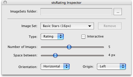
ImageSets folder:
This field shows that path to the folder that contains your image sets. By default it will be the "(stsRating ImageSets)" folder in the same folder that the stsRating DropTool stack is in, but you can point it elsewhere if you like.Image Set:
This dropdown menu displays the image set for the currently selected stsRating instance, but you can change the image set you want to use by dropping down the menu: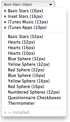 Image sets that are above the separator line are ones that were installed automatically when you dropped the first instance
of an stsRating control onto a stack. Any image sets that are installed have a diamond symbol in front of them. If you want
to use one of the other sets, just select it and if it does not have a diamond in front of it, you will be asked if you want
to install it. If you say "yes", the image(s) or group(s) are copied to the same place as the other stsRating resources and
the selected stsRating control changes to use that image set. The next time you drop down the menu, it will have a diamond
in front of the image set you just installed.
If you are having trouble with an image set for some reason and want to reinstall it, or if you had previously installed
an image set but no longer need it, you can select that image set from the dropdown menu and the "Remove" button next to it
will be enabled. You can then click that button to remove the images. (Make sure you aren't using them in another instance
of the control, otherwise you'll end up with an stsRating control that has no front or back images in it!)
Image sets that are above the separator line are ones that were installed automatically when you dropped the first instance
of an stsRating control onto a stack. Any image sets that are installed have a diamond symbol in front of them. If you want
to use one of the other sets, just select it and if it does not have a diamond in front of it, you will be asked if you want
to install it. If you say "yes", the image(s) or group(s) are copied to the same place as the other stsRating resources and
the selected stsRating control changes to use that image set. The next time you drop down the menu, it will have a diamond
in front of the image set you just installed.
If you are having trouble with an image set for some reason and want to reinstall it, or if you had previously installed
an image set but no longer need it, you can select that image set from the dropdown menu and the "Remove" button next to it
will be enabled. You can then click that button to remove the images. (Make sure you aren't using them in another instance
of the control, otherwise you'll end up with an stsRating control that has no front or back images in it!)
Type:
This option menu allows you to set the "type" for the selected stsRating control instance, which can be either "Rating" or "Choice". The "type" affects how the front images are displayed based the current value of the control, which is set by setting the|
|
|
|
"Rating" |
"Choice" |
Interactive
This checkbox determines whether the user can click on the control and change itsNumber of Images:
This slider lets you set the number of slots to display, from 1 to 10. The default is 5. (If you want to show more than 10 you can set theSpace between:
This slider lets you set number of pixels of space between the slots in the control, from 1 to 20 pixels. The default is 4 pixels. (If you want a larger gap than 20 pixels you can set theOrientation:
This option menu lets you pick whether you want to display the control in a horizontal or vertical orientation. The default is "Horizontal". Note that the choice here also affects the "Origin" (see below).Origin:
This option menu lets you pick the direction from which to draw the slots. If the Orientation is "Horizontal", then your choices here are "Left" or "Right". If the Orientation is "Vertical", your choices are "Top" or "Bottom". The default is "Left".Creating Your Own Image Set
If you don't want to use any of the supplied image sets, you can "roll your own". To do so you will need to determine if you want to use a single image for your front/back layer(s) or whether you want to use a series of images. Remember that you can make both layers the same kind, or you can have one layer be "single image" and the other layer be "series"; it's up to you. An image set is composed of an outer group object that encloses either two image objects (for a "single/single" image set), two group objects, each with a series of images (for a "series/series" image set), or one image and one group object (for a "single/series" image set). The rules are:- The outer group can be named whatever you like.
- The outer group must have a custom prop named uSTSRatingTypewith a value of "ImageSet".
- The outer group must have two additional custom properties - uBackObjanduFrontObj- that identify the image or group that will be used for the back and front layers (respectively).
- The custom properties use the syntax: {image|group},shortObjectName
- The outer group must contain two image objects, two group objects, or one of each.
- If you have an inner group object, the images it contains must be named the same as the inner group object, plus a number corresponding to its sequence order (starting with "1")
- You must adhere to the "Same Size" rule for a given slot, otherwise your results will be wonky.
Examples
In the examples below, the red and blue rectangles are just there to indicate inner and outer group relationships and really don't exist in the actual image sets. I'm also using real image sets for the examples, but I'm shortening the object names for clarity."Single/Single" Image Set Example
I'm using the "Basic Star (32px)" image set for this example:| Preview | Object Hierarchy | Custom Property | Value |
 |
group "Basic Stars (32px)" | uBackObj | image,BasicStars32-B |
| uFrontObj | image,BasicStars32-F | ||
|
image "BasicStars32-B" image "BasicStars32-F" |
"Series/Series" Image Set Example
I'm using the "Questionnaire" image set as an example:| Preview | Object Hierarchy | Custom Property | Value |
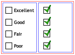 |
group "Questionnaire Checkboxes" | uBackObj | group,QACB-B |
| uFrontObj | group,QACB-F | ||
|
group "QACB-B" image "QACB-B1" image "QACB-B2" image "QACB-B3" image "QACB-B4" |
|||
|
group "QACB-F" image "QACB-F1" image "QACB-F2" image "QACB-F3" image "QACB-F4" |
"Series/Single" Image Set Example
I'm using the "Numbered Spheres" image set as an example (the object names are sligh:| Preview | Object Hierarchy | Custom Property | Value |
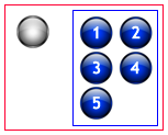 |
group "Numbered Spheres (32px)" | uBackObj | image,NumSphere32-B |
| uFrontObj | group,NumSphere32-F | ||
| image "NumSphere32-B" | |||
|
group "NumSphere32-F" image "NumSphere32-F1" image "NumSphere32-F2" image "NumSphere32-F3" image "NumSphere32-F4" image "NumSphere32-F5" |
Putting It All Together
To make an image set, you just:- Create a brand new stack (it doesn't matter what it's internal name or title is)
- Import/copy your image(s) onto the card
- Name and group them according to the rules above
- Set the uFrontObjanduBackObjof the outer group with the proper references to the image/group used for the front and back layers of the image set
- Set the uSTSRatingTypeof the outer group to "ImageSet"
- Save the stack with whatever name you want to give it
Using Images "On the Fly"
If you don't want to go to the trouble of making your own image set, you can just use existing images or groups of images. To do so, you simply need to set theThe following tables show you how to interact with the DropTool from your scripts:
Custom Properties
Commands/Functions
These commands must be "sent" to the instance of the control or triggered from the script of the control itself.
| Command | Parameters | Notes |
| stsRating_Init | (none) | Redraws the control using the existing custom property values assigned to it. |
Version History
| Version | Release Date | What's Changed |
| 1.0 | 07-16-2011 | First public version. |
 droptools@sonsothunder.com